
Supercycle
Supercycle
Service: logo redesign concept
Service: logo redesign concept
About the business
About the business
SuperCycle was founded by two friends, Lilli and Rhana, who shared a passion for music and dance-cycling. They wanted to create a space where people could feel energized, motivated, and connected through movement. Inspired by the joy and power of combining rhythm with fitness, they launched SuperCycle to offer a fun, challenging, and supportive workout experience that brings people together.
SuperCycle was founded by two friends, Lilli and Rhana, who shared a passion for music and dance-cycling. They wanted to create a space where people could feel energized, motivated, and connected through movement. Inspired by the joy and power of combining rhythm with fitness, they launched SuperCycle to offer a fun, challenging, and supportive workout experience that brings people together.
The concept
The concept
The SuperCycle design concept focuses on creating a clean, simple, and recognizable identity that embodies energy and movement. Every element is crafted to reflect a dynamic and modern feel while ensuring the design remains scalable and versatile across different platforms. This approach ensures a strong, lasting visual presence that resonates with our vibrant, fitness-driven community.
The SuperCycle design concept focuses on creating a clean, simple, and recognizable identity that embodies energy and movement. Every element is crafted to reflect a dynamic and modern feel while ensuring the design remains scalable and versatile across different platforms. This approach ensures a strong, lasting visual presence that resonates with our vibrant, fitness-driven community.
S+C / rider element
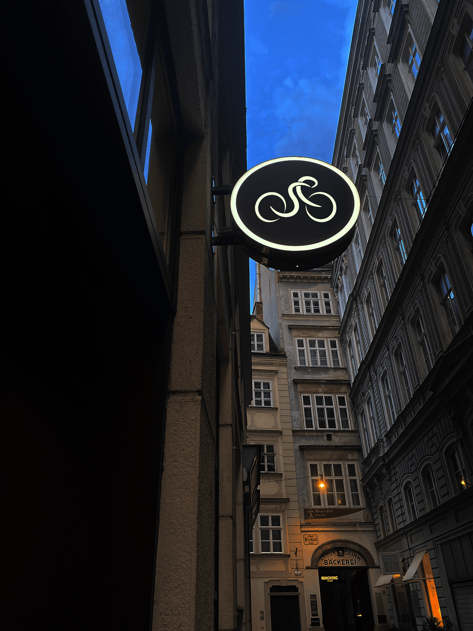
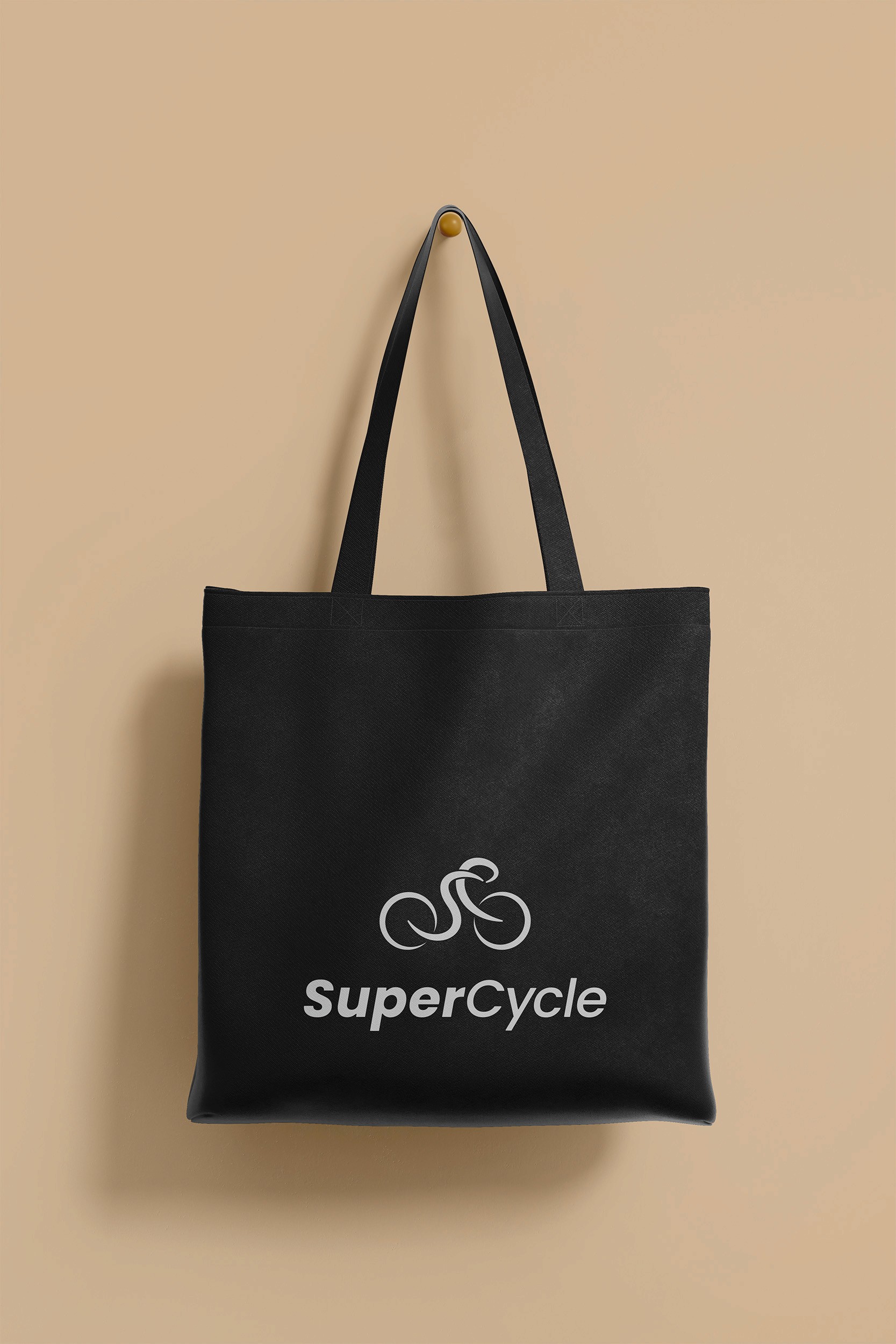
The logo’s S+C is designed to resemble a person riding a bike, symbolizing the connection between the rider and the energy of movement. This dynamic design reflects the strength, rhythm, and individuality each person brings to SuperCycle, emphasizing that every ride is personal and driven by purpose.


Bike element
The bike tires in the logo feature sharp, incomplete circles, representing motion, speed, and continuous progress. This design reflects the momentum and determination of every SuperCycle ride, reminding us that fitness is a journey of growth, where each pedal stroke moves you closer to your goals.


S+C / rider element
The logo’s S+C is designed to resemble a person riding a bike, symbolizing the connection between the rider and the energy of movement. This dynamic design reflects the strength, rhythm, and individuality each person brings to SuperCycle, emphasizing that every ride is personal and driven by purpose.
Bike element
The bike tires in the logo feature sharp, incomplete circles, representing motion, speed, and continuous progress. This design reflects the momentum and determination of every SuperCycle ride, reminding us that fitness is a journey of growth, where each pedal stroke moves you closer to your goals.














Ready to bring YOUR idea to life?
Book a free consultation with me and let’s chat about your vision!
